


| Mercifully for long-time Vinland Map followers, only a few pages of the book are about anatase. One major theme is the consistent distortion evident when comparing the Vinland Map with the closely-related outlines of the 1436 world map by Andrea Bianco. How surprised should we be that most of the simple distortions shown here are NOT evident in that relationship? | |
| Here's our basic outline (taken from the Bianco map), which is reproduced on all the following examples. East was at the top on the Bianco map. | |
| Just to get them out of the way- rotation is not very important, unless different parts of the map are rotated in different directions. | |
| The same applies to changing the map scale- if it's done consistently over the whole map, we can make them look the same simply by changing our viewpoint, but it would be a different matter if parts of the map were copied at various scales. | |
| Here is an example where a short stretch of the Danish coastline has been drawn longer on the copy than on the original, but everything else is an exact copy. | |
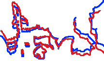
| Here is a variant on the same idea. In this case, it's not a line that has been extended but the space between separate lines. | |
| This looks like rotation again, but it isn't, it's skew, in which the image is given an angular distortion affecting one dimension. | |
| Here's another one-dimensional distortion, this time of size rather than angle- a stretch, if you like. This is what one might have expected the Vinland Map maker to do when trying to turn the round Bianco version of the Old World into an oval. | |
| This is much more complex, but quite useful for maps, because it helps to compensate for the impossibility of representing a globular planet on a flat surface. This is a conic distortion, in which parallel and equal straight lines start to look like sections of rings drawn round the circumference of a cone. | |
| One important thing to understand about the relationship between the Vinland Map and the Bianco map is that the Vinland Map's distortions do not make it more accurate, by either medieval or modern standards (except that it gives a better idea of the size of the Baltic Sea). It seems that the distortions were introduced to hide the Vinland Map's dependence on the Bianco map- but if that were the case, why not go the whole hog and draw it freehand? Here are outlines from a couple of other 15th century maps, to show what I mean: | |
| This one, a section from another circular world map was originally painted (very beautifully) by Fra Mauro in 1459, and was actually made with Bianco's help- but it clearly hasn't been copied directly from his work, as indicated by the position of Ireland, the size of the Baltic and other significant differences. Over the whole map, the differences are very striking indeed. | |
| Leardo's map of 1442 may have used some of the same sources as Bianco ("portolan" sailing charts) but is still very very different on every level. Note how its depiction of the direction of the Mediterranean coasts has more in common with Fra Mauro than Bianco. | |
| |